Numbers That Lie: How Token Dashboard Metrics Are Masking the True State of Your Crypto Wealth

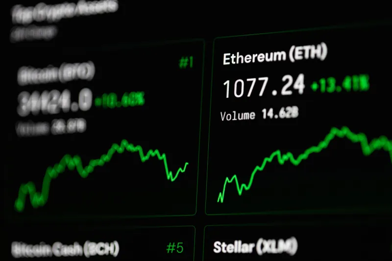
There is a particular kind of confidence that comes from watching a dashboard full of green. Portfolio value climbing. Token counts holding steady. Wallet activity looking robust. For millions of American crypto holders, these digital readouts have become the primary lens through which they assess their financial health. The problem is that many of those metrics were never designed to tell the whole story — and some of them actively obscure what is really happening beneath the surface.
This is not a fringe concern. As token ecosystems grow more complex and the tools used to monitor them become increasingly sophisticated in appearance, the gap between what dashboards display and what they actually measure has widened considerably. Understanding that gap is no longer optional for investors who take their digital asset portfolios seriously.
The Illusion of Portfolio Value
The most visible number on any token dashboard is total portfolio value — typically expressed in USD. It feels authoritative. It updates in real time. It responds to market movements with satisfying precision. And yet, for most holders, it represents one of the least reliable indicators of genuine wealth.
The core issue is liquidity. Portfolio value calculations are almost universally based on the last traded price of a given token, multiplied by the number of tokens held. What that figure does not account for is whether you could actually realize that value by selling. For tokens with thin order books, low daily trading volume, or concentrated ownership, the difference between the quoted price and the executable sell price — known as slippage — can be substantial. A position nominally worth $40,000 may only yield $28,000 or less in practice, depending on market depth at the time of exit.
Sophisticated holders understand that portfolio value is an estimate, not a guarantee. The metric becomes meaningful only when paired with liquidity data, and most standard dashboards do not surface that relationship clearly.
Transaction Volume: Activity Is Not the Same as Health
Another widely cited metric is on-chain transaction volume — the aggregate dollar value of transfers involving a particular token over a given period. High volume is typically interpreted as a sign of a healthy, active ecosystem. Institutional-grade analytics platforms display it prominently. Retail investors cite it as a bullish signal.
But volume can be manufactured. Wash trading — in which the same entity buys and sells a token to itself across multiple wallets — inflates volume figures without representing genuine market interest. While major centralized exchanges have faced regulatory scrutiny over this practice, decentralized environments are harder to police, and the behavior persists. A token boasting impressive 24-hour volume may owe a significant portion of that figure to circular transactions with no economic substance.
Even organic volume can mislead. A token experiencing high volume during a period of price decline is not exhibiting strength — it is exhibiting panic selling. Volume without directional context is noise, not signal.
Holder Count and the Concentration Problem
Dashboards frequently highlight the number of unique wallet addresses holding a given token as a measure of adoption and decentralization. A rising holder count feels like community growth. It suggests broad distribution and reduced concentration risk. In many cases, however, it tells a more complicated story.
Wallet proliferation does not equal genuine user growth. A single sophisticated actor can operate hundreds of wallets. Airdrop campaigns routinely generate thousands of new wallet addresses that hold tokens briefly before selling or abandoning them entirely. More critically, the raw holder count says nothing about the distribution of ownership. A token with 50,000 holders may still have 80 percent of its circulating supply concentrated in the top 20 wallets — a structural fragility that no holder count metric will reveal on its own.
The relevant question is not how many wallets hold a token, but how ownership is distributed across those wallets. Gini coefficient analysis and supply concentration charts are far more informative, yet they rarely appear on standard retail-facing dashboards.
APY Figures and the Yield Mirage
For holders participating in staking or liquidity provision, annualized percentage yield (APY) figures occupy a place of particular prominence on most dashboards. These numbers can appear extraordinary — triple-digit returns that seem to validate the decision to allocate capital to a given protocol.
The problem is that most APY calculations are projections based on current reward rates, which are subject to rapid and significant change. Reward rates fluctuate with protocol participation levels, governance decisions, and token emission schedules. A staking pool offering 140 percent APY today may be offering 18 percent six weeks from now as more capital flows in and dilutes the reward pool. Meanwhile, the underlying token's price may have declined, meaning the nominal yield is being earned in an asset that has lost purchasing power.
True yield, properly understood, must account for token price movement during the staking period, the real cost of impermanent loss where applicable, and the tax treatment of rewards under current IRS guidance. None of these adjustments appear automatically in a dashboard APY figure.
What Metrics Actually Deserve Your Attention
None of this is an argument against using dashboards. It is an argument for using them with greater precision and skepticism. Several metrics genuinely deserve weight in any rigorous portfolio assessment.
Real liquidity depth — the actual buy and sell orders sitting within a defined price range around the current market price — is one of the most underutilized indicators available to retail investors. Tools that surface order book depth or liquidity pool composition give a more honest picture of exit conditions than price alone.
Token velocity, which measures how frequently tokens change hands relative to total supply, can indicate whether a token is functioning as a medium of exchange or simply being held speculatively. Very low velocity in a token designed for transactional use may signal weak adoption. Very high velocity in a governance token may suggest that holders are not treating it as a long-term stake.
Developer activity metrics — commit frequency, active contributors, and protocol upgrade cadence — are available through on-chain data and public repositories for many projects. These figures speak to the long-term viability of an ecosystem in ways that price charts cannot.
Building a More Honest Portfolio Picture
The digital asset space has made extraordinary strides in data transparency. More information is available to American token holders today than at any previous point in the market's history. The challenge is not access to data — it is the discipline to look past the metrics that feel reassuring and focus on the ones that are genuinely diagnostic.
At TatuToken, the premise is straightforward: owning a piece of a digital ecosystem carries real responsibilities. One of those responsibilities is understanding what your holdings actually represent — not what a dashboard optimized for engagement tells you they represent. The investors who build durable wealth in this space will be the ones who learn to ask harder questions of the numbers in front of them.
Green does not always mean go. And a portfolio that looks healthy on the surface may be carrying vulnerabilities that only become visible when it is too late to act.